
- Title
-
Single-cell transcriptome profiling reveals diverse immune cell populations and their responses to viral infection in the spleen of zebrafish
- Authors
- Hu, C.B., Wang, J., Hong, Y., Li, H., Fan, D.D., Lin, A.F., Xiang, L.X., Shao, J.Z.
- Source
- Full text @ FASEB J.
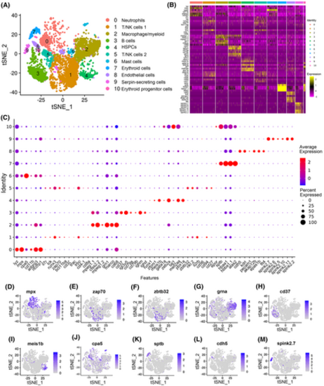
Categorization of the main immune cell types in zebrafish spleen. (A) tSNE nonlinear clustering was used to visualize the classification of the populations of zebrafish splenic leukocytes. PCA was performed after expression data were normalized. Dimension reduction was performed through PCA to reduce variables. Then, the clustering algorithm based on graph theory was used to cluster cells. (B) Heatmap of marker genes from each cluster. Each column in the figure represents a cell subtype, and each row represents a gene. The expression levels of genes in different cells are indicated by different colors. An intensely yellow color indicates high expression, and an intensely purple indicates low expression. (C) Dot plots showing the expression levels of marker genes and the percentages of cells per cluster that express the selected gene. (D–M) tSNE results of the molecular markers of the 10 immune cell types. The title of each subimage is the name of the marker gene. Each dot in the figure represents a cell, and dark dots indicate the high expression of the marker gene in a specific cell. Neutrophil marker gene in (D), T-cell marker gene in (E), NK-cell marker gene in (F), macrophage/myeloid cell marker gene in (G), B-cell marker gene in (H), HSPC marker gene in (I), mast cell marker gene in (J), erythroid cell marker gene in (K), endothelial cell marker gene in (L), and serpin-secreting cell marker genes in (M). |
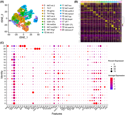
T/NK-cell subtype analysis based on single-cell gene expression. (A) Graph-based clustering of T/NK cells showing the 21 subclusters in the control group. tSNE nonlinear clustering was used to visualize the different classification results of T/NK-cell populations in zebrafish spleen. (B) Heatmap of marker genes from each cluster. Each column in the figure represents a cell subtype, and each row represents a gene. The expression levels of genes in different cells are indicated by different colors. (C) Dotplots showing the expression levels of marker genes and percentages of cells per cluster that express the gene of interest. |
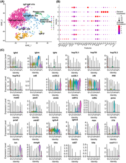
B-cell subtype analysis based on single-cell gene expression. (A) Graph-based clustering of B cells showing eight subclusters. (B) Dotplots showing the expression of selected genes across cell clusters. The size of the dot reflects the percentage of cells within a class expressing the gene, while the color intensity indicates the average expression level of “expressing” cells. (C) Violin plots of eight clusters of B-cell population molecular markers. The title of each subimage is the name of the marker gene. |

Pseudotemporal analysis of the development of zebrafish spleen B cells with Monocle. (A, B) Pseudotime single-cell trajectory of B cells reconstructed by Monocle2. The pseudotime is shown colored in a gradient from dark to light blue, and its beginning is indicated. (C) Distribution of the eight B-cell subsets in the trajectory. (D) Pseudotemporal heatmap showing the gene expression dynamics of significant marker genes. Genes (rows) were clustered into three modules, and cells (columns) were ordered in accordance with pseudotime. |

Identification of macrophage/myeloid cell subtypes. (A) Dot plot showing the expression levels of marker genes and the percentages of macrophages/myeloid cell per cluster that express the gene of a specific cell population subtype. (B) Heatmap of marker genes from each cluster. Each column in the figure represents a cell subpopulation, and each row represents a gene. The expression levels of genes in different cells are indicated by different colors. (C) tSNE nonlinear clustering was used to visualize the differences in the classification results of macrophage/myeloid cell populations between the control group (PBS) and the SVCV-infected group. Numbers represent the percentages of cells in each cluster. (D) Histogram presenting the different macrophages/myeloid cell ratios between the control group and the SVCV-infected group. (E) Histogram illustrating the difference in macrophage/myeloid cell number in each cluster between the control group and the SVCV-infected group. |

Neutrophil subtype analysis based on single-cell gene expression. (A) Graph-based clustering of neutrophils showing nine subclusters in the control group (PBS) and the SVCV-infected group. The significantly increased and decreased neutrophil subtypes in the SVCV-infected group, where the numbers represent the percentages of cells in each cluster. (B) Heatmap of marker genes from each cluster. Each column in the figure represents a cell subpopulation, and each row represents a gene. (C,D) GO, and KEGG analysis results of cluster 0. RichFactor refers to the ratio of the number of differentially expressed transcripts located in the pathway entry to the total number of transcripts located in the pathway entry in all transcripts. A high RichFactor indicates a high degree of enrichment. The Q value is the p value after multiple hypothesis test correction. The value range is 0 to 1. A value close to zero is indicative of highly significant enrichment. The graph is used to sort the top 20 paths in ascending order on the basis of the Q value. (E, F) GO, and KEGG analysis results of cluster 4. |
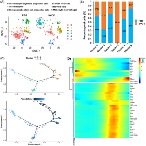
HSPC subtype analysis based on single-cell gene expression. (A) Graph-based clustering of HSPC showing five subclusters in the control group (PBS) and six subclusters in the SVCV-infected group. The novel HSPC subtype in the SVCV-infected group is denoted by a black dotted circle. (B) Histogram showing the differences in the ratios of HSPC subsets between the control group (PBS) and the SVCV-infected group. (C) Pseudotime single-cell trajectory of HSPCs reconstructed by Monocle2. The pseudotime is colored in a gradient from dark to light blue, and its beginning is indicated. (D) Pseudotemporal heat map showing the gene expression dynamics of significant marker genes. Genes (rows) were clustered into three modules, and cells (columns) were ordered in accordance with pseudotime. |
Analysis of the characteristics of cluster 3 HSPCs. (A) tSNE nonlinear clustering was used to visualize the differences in the classification results of the HSPC population between the control group (PBS) and the SVCV-infected group. Cluster 3 cells are denoted by red dots, and numbers represent the percentages of cells in this cluster. (B) Violin plots presenting the top 10 up-regulated expression genes of the cluster 3 cell population distributed in all clusters. Gene expression was normalized, and each graph represents the average expression of the gene in each cluster. (C) GO enrichment analysis of genes in cluster 3. (D) KEGG enrichment analysis of the cluster 3 cell population. |

Change in zebrafish spleen immune cell categories in response to SVCV infection. (A) tSNE nonlinear clustering was used to visualize the differences in the classification results of the populations of zebrafish spleen leukocytes between the control group (PBS) and the SVCV-infected group. (B) Histogram showing the differences in cell ratios between the control group and the SVCV-infected group. (C) Histogram presenting the differences in the cell numbers of each cluster between the control group and the SVCV-infected group. |
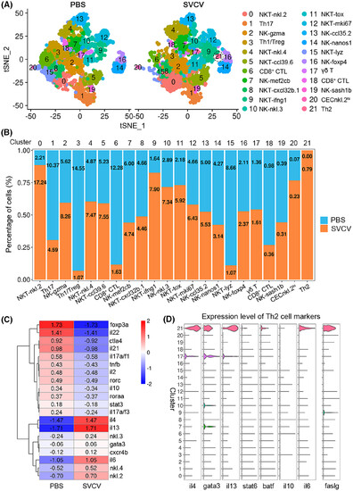
Change in T/NK-cell subtypes in response to SVCV infection. (A) Graph-based clustering of T/NK cells showing 21 subclusters in the control group (PBS) and 22 subclusters in the SVCV-infected group. tSNE nonlinear clustering was used to visualize the differences in the classification results of the zebrafish spleen leukocyte population between the control group and the SVCV-infected group. Th2 cells in the SVCV-infected group are denoted by dotted circles. (B) Histogram showing the differences in T/NK-cell ratios between the control group and the SVCV-infected group. (C) Heatmap of the significantly differentially expressed marker genes in T/NK-cell subsets between the control group and the SVCV-infected group. The gene names are shown on the right. (D) Violin plots of Th2 cell marker genes distributed in all clusters. Gene expression was normalized, and each graph represents the average expression of the gene in each cluster. |

Change in B-cell subtypes in response to SVCV infection. (A) tSNE nonlinear clustering was used to visualize the differences in the classification results of B populations between the control group (PBS) and the SVCV-infected group. (B) Histogram illustrating the differences in B-cell ratios between the control group and the SVCV-infected group. (C) Heatmap of the differentially expressed genes for apoptosis, ferroptosis, necroptosis, and autophagy in the cluster 0 B-cell subset between the control group and the SVCV-infected group. (D) Top 20 most significant KEGG pathways for the cluster 0 B-cell subset. |
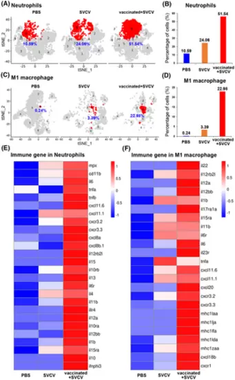
Induction of trained immunity in neutrophils and M1-macrophages through the vaccination of zebrafish with inactivated SVCV. (A) tSNE nonlinear clustering was used to visualize the percentages of neutrophils in the PBS-administered (control), SVCV-infected (infected), and SVCV-vaccinated plus SVCV-infected (vaccinated+SVCV) groups. (B) Histogram showing the differences in neutrophil percentages among PBS-administered, SVCV-infected, and vaccinated+SVCV groups. (C) tSNE nonlinear clustering was used to visualize the percentages of M1-macrophages in PBS-administered, SVCV-infected, and vaccinated+SVCV groups. (D) Histogram of different M1-macrophage percentages in PBS-administered, SVCV-infected, and vaccinated+SVCV groups. (E) Heatmap of important immune genes in neutrophils that are differentially expressed among the PBS-administered, SVCV-infected, vaccinated+SVCV groups. (F) Heatmap showing the important immune genes that are differentially expressed in M1-macrophages among the PBS-administered, SVCV-infected, and vaccinated+SVCV groups. |
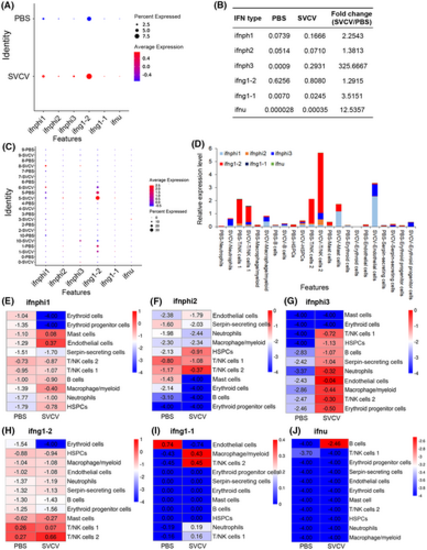
Analysis of IFN-producing immune cell types before and after SVCV infection. (A) Dotplots showing the six types of IFNs that were significantly up-regulated during viral infection and differentially expressed in zebrafish spleen leukocytes. (B) Average expression level of six IFN genes in all leukocytes between the control (PBS) and SVCV-infected zebrafish spleen. (C) Dotplots of the six IFN genes that are differentially expressed in each cluster of leukocytes between control and SVCV-infected zebrafish. (D) Histogram of the six types of IFNs that are differentially expressed in each cluster of leukocytes between control and SVCV-infected zebrafish. (E–J) Heatmap of six IFN genes that are differentially expressed in each cluster of leukocytes between the control and SVCV-infected zebrafish. |
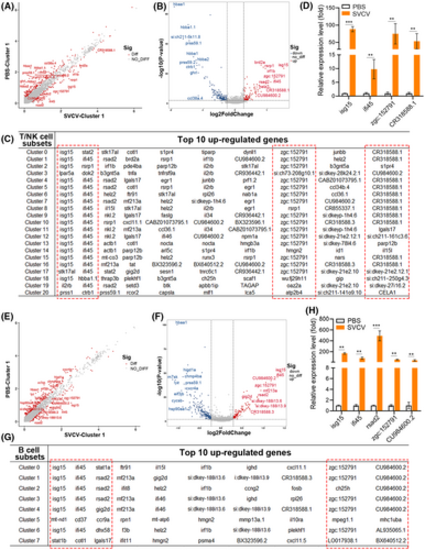
Analysis of key virus-responsive genes beyond IFN genes in T/NK and B-cell subtypes upon SVCV infection. (A, B) Scatter plot (A) and volcano plot (B) of DEGs that were selectively examined in cluster 1 T-cell subtypes between the control and SVCV-infected groups. (C) Top 10 up-regulated genes in each cluster of T/NK cells. The red dashed box indicates the significantly up-regulated genes in almost each subtype of T/NK cells upon SVCV infection. (D) Selective RT-qPCR examination of four key virus-responsive genes (isg15, ifi45, zgc:152791, and CR318588.1) in T/NK cells upon SVCV stimulation. (E, F) Scatter plot (E) and volcano plot (F) of selectively examined DEGs in cluster 1 B-cell subtypes between the control and SVCV-infected groups. (G) Top 10 up-regulated genes in each cluster of B cells. The red dashed box indicates the significantly up-regulated genes in almost each subtype of B cells upon SVCV infection. (H) Selective RT-qPCR examination of five key virus-responsive genes (isg15, ifi45, rsad2, zgc:152791, and CU984600.2) in B cells upon SVCV stimulation. Error bars represent SD. All data were obtained from at least three independent experiments. **p < .01, ***p < .001. |
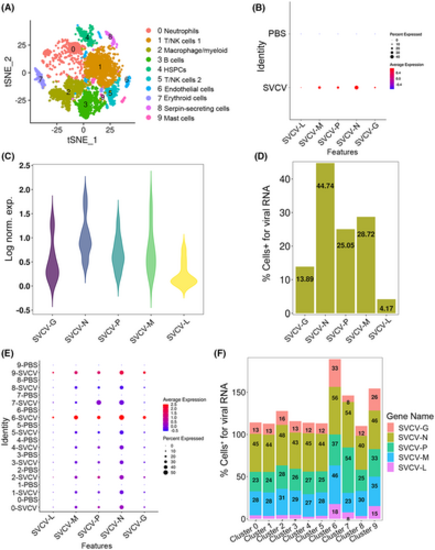
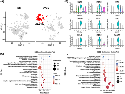
scRNA-seq reveals SVCV-infected cells in spleen tissue. (A) The tSNE nonlinear clustering was used to visualize the classification results of zebrafish spleen leukocyte populations after integrating the nucleic acid sequences of SVCV into zebrafish genome. PCA analysis was performed after the expression of the data was normalized. Dimension reduction was performed by principal component analysis to reduce variables. Then, the clustering algorithm based on graph theory is used to cluster the cells. (B) Dotplots show the level of expression of five SVCV genes and the percentage of cells per cluster that express these genes. (C) The expression of five SVCV genes in the spleen cells was shown as a violin plot. The Y-axis represents the log-normalized expression value. (D) The percentage of cells identified by scRNA-seq that were positive for any reads aligning to the viral genome by SVCV-infected. (E) Dotplots results show five SVCV genes differentially expressing per cluster of immune cells between PBS and SVCV-infected zebrafish. (F) Percentage of cells from the SVCV-infected samples positive for any reads aligning to the viral genome grouped by cell type. |