
- Title
-
Gene Expression Profile Provides Novel Insights of Fasting-Refeeding Response in Zebrafish Skeletal Muscle
- Authors
- Sugasawa, T., Komine, R., Manevich, L., Tamai, S., Takekoshi, K., Kanki, Y.
- Source
- Full text @ Nutrients
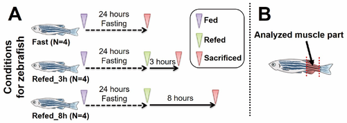
Figure 1. The overview of the experimental protocol. (A) The timing of experimental interventions in each group. (B) The location of the collected skeletal muscle tissue. |
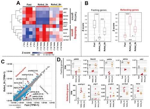
Figure 2. Gene expression profile of muscle tissues during fasting-refeeding conditions in zebrafish. (A) PCA plot and (B) cluster dendrogram depict similarities between samples. (C) Venn diagram shows the number of DEGs between three groups (Refed_8h vs. Refed_3h, Refed_3h vs. Fast, and Refed_8h vs. Fast). (D) Heat map represents expression of the 1091 DEGs. Values in the rows are z-scores. (E) Box plot shows expression patterns in each cluster on the heat map. The box indicates the first to the third quartile and the line indicates the median. The whiskers show the box with 5–95 percentile. **** p < 0.0001.
|
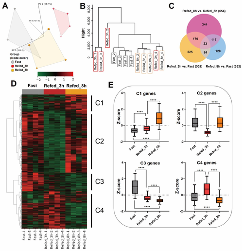
Figure 3. Enrichment analysis in KEGG pathway for gene clusters with confirmed expression values of individual samples. (A) Bar plots represent the analysis of significantly enriched pathways in each cluster. (B) Individual samples with TPM values of genes: trim63a, fbxo32, fbxo25, and cdkn1a. The bar indicates average mean. (C) Individual samples with TPM values of genes: myog, myod1, and slx1b. The bar indicates average mean.
|
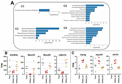
Figure 4. Identification of most affected genes in muscle tissues by fasting-refeeding. (A) Heat map reflects expression values as z-score for 10 genes (5 genes of each condition) identified as most responsive genes to fasting-refeeding conditions. Each group (Fast, Refed_3h, Refed_8h) is represented by 4 individual samples. (B) Box plot depicts a z-score of 10 genes in each group. The box indicates the first to the third quartile, and the line indicates the median. The whiskers show the box with 5–95 percentile. (C) Scatter plot reflects averages of TPM + 1 values of each gene, shown as red dots. Numbers in parentheses indicate the fold change between the Fast and Refed_3h groups. Gray dots indicate non-DEGs; light blue dots indicate DEGs as FDR p-value < 0.05. (D) Plot graph represents TPM values of individual samples with “fasting genes” and “refeeding genes”. The TPM values of fasting genes are represented by Log10 notation. The bar indicates average mean. * p < 0.05; *** p < 0.001.
|
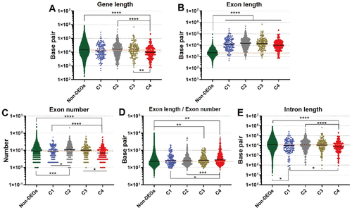
Figure 5. Analysis of gene length, exon length, and exon number in response to refeeding. The graphs show gene length (A), exon length (B), exon number (C), exon length/exon number (D), and intron length (E). The bar indicates the average mean and the orange dashed line shows the average mean of the non-DEGs. * p < 0.05, ** p < 0.01, *** p < 0.001, **** p < 0.0001, respectively.
|