
- Title
-
The Cyanotoxin 2,4-DAB Reduces Viability and Causes Behavioral and Molecular Dysfunctions Associated with Neurodegeneration in Larval Zebrafish
- Authors
- Martin, R.M., Bereman, M.S., Marsden, K.C.
- Source
- Full text @ Neurotox Res

Experimental design. A 2D simplex axial design and randomized Design of Experiments (DoE) design grid representing the composition for each solution. B Exposure plan for larval zebrafish from 6 h post fertilization (hpf) to 6 days post fertilization (dpf) followed by the high throughput behavior testing, proteomics analysis, and endpoints measurements for these studies |
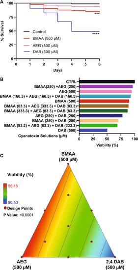
Viability assessment. A Kaplan–Meier cumulative survival plots comparing percent survival between four treatment groups: Control (n = 108), BMAA (n = 162), AEG (n = 162), and 2,4-DAB (n = 108) (P < 0.001, Mantel-Cox log-rank test). B Bar graph representing percent viability across all treatment groups. C 2D contour plot representing zebrafish percent viability in response to each mixture of BMAA, AEG, and 2,4-DAB (Linear regression model, P < 0.0001) |

Spontaneous Locomotion Response. A–C Bar graphs represent the total distance traveled during the 18.5 min spontaneous movement assay for each larva and average speed across the same assay for BMAA, AEG, and 2,4-DAB alone, their binary mixtures, and three-component mixtures, respectively. Levels not connected by the same letter are significantly different (Tukey–Kramer HSD, Alpha 0.05) |

BMAA and AEG augment the short-latency c startle (SLC) response. |

2,4-DAB modulates kinematics of the C startle response. |

A Venn diagram shows no overlap in the differentially Expressed Proteins (DEPs) between 2,4-DAB (500 µM) zebrafish larvae exposed groups at 2 dpf (left) and 4 dpf (right). B Top 10 DEPs found to be up or downregulated in the zebrafish larvae groups that were exposed to 2,4-DAB from 6 hpf until 4 days post fertilization (4 dpf). C Pie chart showing the percentage of enriched GO Biological Processes derived from each set DEPs time points: 2- and 4-day post fertilization. D Top 20 canonical pathways found to be activated or inhibited in the zebrafish larvae groups that were exposed to 2,4-DAB until 4 days post fertilization (4 dpf). Red shading indicates predicted activation (z-score > 2), and blue shading indicates predicted inhibition (z-score < − 2). This bar graph width represents enrichment values in the form of minus log of p value that were greater than 1.3 |

Systematic proteomics analysis of developmental changes in protein expression in control and 2,4-DAB (500 µM) treated zebrafish larvae. A DEPs were identified in by comparing 4 dpf and 2 dpf samples in control and 2,4-DAB-treated larvae. Venn diagram showing DEP overlap between control and the 2,4-DAB treatment. B Canonical pathways impacted during development from 2 to 4 dpf in control and 2,4-DAB samples. C Predicted upstream regulators. D Diseases and biological functions. The red- or blue-colored rectangles in each column indicate the z-score activities for each analysis. Red shading indicates predicted activation and blue shading indicates predicted inhibition. This heat map represents the activated of inhibited z-scores that were greater than the absolute value of 2 |